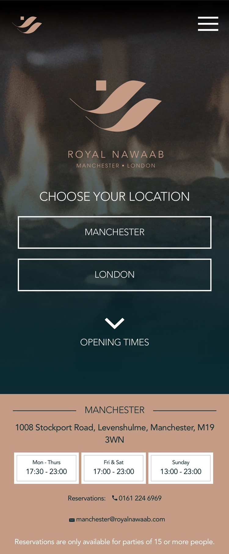
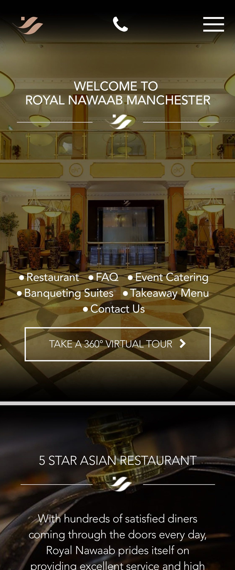
Responsive design for pint-sized screens
Whether they’re already out in a pub and want to find out more about a guest ale, or they’re looking for somewhere local to try a drink they haven’t had before, an ever-growing number of people use their smartphone for quick searches of their local area.
To appear in those searches, you need a mobile-friendly website design. Google already prioritised sites that display well on smaller screens, and are increasingly filtering out those that are built for desktop displays only.
Responsive website designs for breweries include a fully fledged desktop website design with all of the detail and high-resolution imagery you would expect, but when displayed on a smaller screen this can automatically adjust to a simpler, faster-loading page.
It’s a great way to reach consumers no matter what device they use to visit your site, while ensuring your core functionality such as newsletter registrations and online ordering continue to work even on mobile phones.

